Why Resume Formatting Matters for Your Job Search

Resume formatting is the organization and presentation of your resume content, and it directly determines whether ATS software and hiring managers select your application for an interview. Most job seekers focus entirely on what they write and ignore how it looks on the page. That is a costly mistake. 53% of recruiters prefer simple, text-based PDF resumes without images or complex graphics. Your layout, font choice, section order, and use of white space all send signals before a recruiter reads a single word of your experience.
Why resume formatting matters for ATS and recruiter screening
Applicant Tracking Systems, commonly called ATS, are software programs that parse and rank resumes before a human ever sees them. Approximately 75% of resumes are rejected by ATS before reaching a recruiter’s desk. That rejection often has nothing to do with your qualifications. It comes down to formatting choices that prevent the system from reading your content correctly.
ATS software reads resumes the way a basic text scanner would. It looks for recognizable section headings like “Work Experience,” “Education,” and “Skills.” It expects a clean, linear flow of text. Single-column resumes with common section headings perform better with ATS parsing than multi-column or table-based layouts. When you use a two-column design or embed your contact details inside a header graphic, the ATS often skips that content entirely.
Graphics, images, and decorative charts create the same problem. The ATS cannot extract text from an image. If your skills section is a visual rating bar graphic, the system reads nothing. Your strongest qualifications disappear before a human ever has the chance to evaluate them.
- Use standard section headings: “Work Experience,” “Education,” “Skills,” “Certifications”
- Avoid tables, text boxes, and multi-column layouts
- Remove photos, skill bar graphics, and decorative icons
- Keep your contact information in the main body of the document, not in a header or footer
Pro Tip: Saving your resume as a PDF preserves your formatting across platforms and aids ATS readability compared to Word documents or other file types. Always check the job posting first, though. Some older ATS systems still prefer .docx files.
For a deeper breakdown of how to structure your document for ATS success, the ATS resume guide from JobAlign covers the technical requirements in detail.
What are the professional resume formatting standards in 2026?
Formatting conventions exist because they work. They reflect decades of recruiter feedback and, more recently, ATS algorithm requirements. Following them is not about being boring. It is about removing every barrier between your qualifications and the person making the hiring decision.

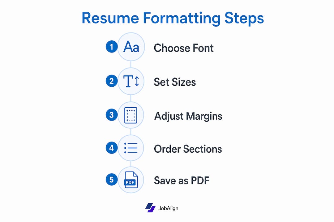
Recommended font sizes are 10–12 point for body text and 14–20 point for headings, with margins of 0.5–1 inch on all sides. These numbers are not arbitrary. They reflect what is readable on a standard screen and what ATS parsers handle without errors.
| Formatting element | Recommended standard |
|---|---|
| Body font size | 10–12 pt |
| Heading font size | 14–20 pt |
| Margins | 0.5–1 inch all sides |
| Layout | Single column |
| Section order | Reverse chronological |
| File format | PDF (unless otherwise specified) |
Reverse chronological order is the most widely accepted resume structure. It places your most recent and relevant experience first, which is exactly where recruiters look. Single-column layouts keep the reading flow predictable for both humans and machines. White space between sections gives the eye a place to rest and makes the document feel organized rather than crowded.
Font choice matters more than most job seekers realize. Clean, widely available fonts like Arial, Calibri, and Georgia render correctly across operating systems and ATS platforms. Decorative or custom fonts may display as garbled characters on a recruiter’s screen or fail to parse correctly in ATS software.
Pro Tip: Stick to one font family throughout your resume. Use bold and size variation to create visual hierarchy instead of switching between multiple typefaces. This keeps the document clean and ATS-friendly at the same time.
Why do clean, simple resume designs outperform creative templates?
The psychology behind resume design is more concrete than most people expect. Using clean fonts like Arial enhances processing fluency, which leads to more favorable and quicker recruiter judgments. Processing fluency is the ease with which your brain absorbs information. When reading feels effortless, the reader forms a more positive impression of the content itself.
The reverse is also true. Decorative visual elements such as photographs, charts, and creative fonts tend to distract and reduce a resume’s effectiveness with both ATS and human readers. The recruiter’s attention shifts from your achievements to the design itself. That is the opposite of what you want.
“The biggest misconception is that a polished or creative resume design signals higher candidate quality. In reality, clarity and ease of comprehension trump decorative elements every time.” Research consistently shows that neutral, content-first resumes outperform visually elaborate ones with both ATS filters and human screeners.
There is also a bias risk. Recruiters draw unreliable personality trait inferences from resume design cues, which can unintentionally skew hiring decisions. A bold color scheme might read as “creative” to one recruiter and “unprofessional” to another. A neutral format removes that variable entirely and keeps the focus on your qualifications.
Creative templates are appropriate in one specific context: roles where design is the job. Graphic designers, art directors, and UX designers can use their resume as a portfolio piece. For everyone else, a clean, readable document is the stronger choice. You can learn more about resume design strategies that balance visual appeal with ATS compatibility.
How to apply effective resume formatting: tips and mistakes to avoid
Good formatting is not just about what you include. It is equally about what you remove and where you place what remains.
-
Lead with your strongest material. Expert recruiters prioritize the top third of the first page as the most crucial zone. Place your most relevant achievements and a strong summary statement there. Content buried below the fold gets far less attention.
-
Remove photos, charts, and skill rating graphics. These elements fail ATS parsing and distract human readers. A five-star skill rating graphic tells a recruiter nothing concrete. Replace it with a clean skills list or a quantified achievement.
-
Use consistent bullet points and verb tenses. Start each bullet with a strong past-tense action verb for previous roles (“Led,” “Built,” “Reduced”). Use present tense only for your current position. Inconsistency reads as carelessness.
-
Tailor your keywords to each job description. ATS systems score resumes against the specific language in the job posting. Proper section order with job-specific achievements placed in the top 30–40% of the resume captures the limited attention of hiring managers effectively. Mirror the exact phrasing from the posting where it accurately reflects your experience.
-
Proofread for formatting consistency across platforms. Open your PDF on a different device before submitting. Check that fonts render correctly, spacing is consistent, and no section headings have shifted. What looks perfect in your editor may break on another screen.
Pro Tip: Paste your resume text into a plain text editor like Notepad. If the content reads clearly without any formatting, your structure is solid. If it looks like a jumbled mess, your layout relies too heavily on visual elements that ATS cannot process.
For a full checklist of what to include and what to cut, the best resume tips for 2026 from JobAlign covers both formatting and content in one place. You can also check why IT job applications get rejected for a field-specific look at formatting errors that cost candidates interviews.
Key Takeaways
Resume formatting is the single most controllable factor between your qualifications and a recruiter’s first impression, and clean, ATS-compatible layouts consistently outperform creative designs for the vast majority of job seekers.
| Point | Details |
|---|---|
| ATS compatibility is non-negotiable | Single-column, text-based PDFs pass ATS filters far more reliably than graphic-heavy designs. |
| Font and margin standards exist for a reason | Use 10–12 pt body text, 14–20 pt headings, and 0.5–1 inch margins for ATS and human readability. |
| Simple design outperforms creative templates | Processing fluency research shows clean fonts and neutral layouts produce faster, more favorable recruiter judgments. |
| Top third of page is your prime real estate | Place your strongest achievements and summary in the top 30–40% of the first page where recruiter attention peaks. |
| Tailor keywords to every job posting | ATS systems score resumes against job description language, so generic resumes consistently score lower. |
The formatting mistake I keep seeing cost people interviews
After reviewing hundreds of resumes across industries, one pattern stands out more than any other. Job seekers spend hours perfecting their bullet points and then submit the whole thing inside a two-column template with a colored sidebar. The content is strong. The format kills it.
The sidebar problem is particularly frustrating because those templates look impressive in a design preview. But the ATS reads the sidebar text out of sequence, mixing contact details with job titles and skills with dates. The parsed output is gibberish. A recruiter who does receive it manually has to work to decode the layout. Most do not bother.
The other mistake I see constantly is the skills section built as a visual rating graphic. Five filled circles out of five for “Microsoft Excel” communicates nothing. A recruiter cannot verify it, an ATS cannot parse it, and it takes up space that a quantified achievement could fill. Replace it with a simple comma-separated skills list and use your bullet points to prove those skills with results.
My honest advice: treat your resume like a legal document, not a design portfolio. Every element must serve a clear function. If you cannot explain why a formatting choice is there, remove it. The job seekers who get callbacks are not the ones with the most visually impressive resumes. They are the ones whose qualifications are the easiest to find and verify quickly.
— Johan
How JobAlign helps you get the formatting right from the start
Getting resume formatting right for every application takes time, especially when you are tailoring keywords and structure to each job posting. JobAlign’s LinkedIn resume generator pulls your experience directly from your LinkedIn profile and builds an ATS-optimized resume tailored to the specific job you are applying for. The output follows current formatting standards: single-column layout, clean fonts, proper section order, and PDF delivery. JobAlign reports an 87% success rate at passing ATS filters. You can also browse the ATS-ready resume examples library to see how different roles and industries apply these formatting principles in practice.
FAQ
What is resume formatting and why does it matter?
Resume formatting refers to the layout, font, structure, and organization choices that determine how your resume looks and reads. It matters because both ATS software and human recruiters use these visual and structural cues to quickly assess whether your application is worth reviewing.
What file format should I use for my resume?
Save your resume as a PDF in most cases. PDFs preserve formatting across platforms and improve ATS readability compared to other file types. Always check the job posting first, as some systems specifically request a .docx file.
Should I use a creative or a simple resume template?
Use a simple, single-column template unless you are applying for a design or creative role. Research on processing fluency shows that clean, readable layouts produce faster and more favorable recruiter judgments than decorative designs.
How do I make my resume pass ATS filters?
Use standard section headings, a single-column layout, and common fonts like Arial or Calibri. Remove photos, graphics, and tables. Mirror the exact keywords from the job description in your experience and skills sections.
Where should I put my most important information on a resume?
Place your strongest achievements and a professional summary in the top third of the first page. Recruiters focus most of their attention on that zone during initial screening, so content placed lower on the page receives significantly less review time.