Verify ATS Resume Fonts in 5 Minutes: Quick Plain Text Test
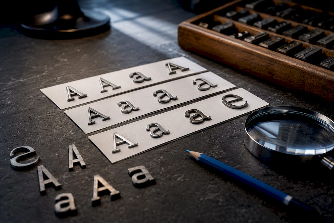
Use Calibri or Arial at an appropriate readable size, saved as a text based .docx file, and you have solved most of the ATS font problem right there. Other safe bets include Times New Roman, Helvetica, Georgia, and Garamond. Before you submit anything, run one quick test: copy your resume text into a plain text editor and check that every word survives the trip.
TL;DR:
- Using system fonts like Calibri, Arial, Times New Roman, Georgia, or Garamond ensures reliable parsing across most ATS platforms without requiring special formatting.
- Font size should be between 10 and 12 points for body text, with larger sizes reserved for names and section headers to maintain clarity and hierarchy.
- Saving resumes as .docx files provides the safest compatibility, while PDFs must be text-based with embedded fonts to avoid parsing errors.
- Testing your resume in plain text editors like Notepad and on different devices helps identify font substitution or garbled characters that could hinder ATS recognition.
- Creative fonts, decorative icons, and excessive styling elements should be avoided, as they can cause parsing failures and diminish professional readability.
Table of Contents
- What Are the Best ATS Resume Fonts to Use?
- Why Does Font Choice Matter for ATS Parsing?
- What Font Size and Spacing Should You Use?
- Should You Save Your Resume as a .docx or PDF?
- Which Fonts Should You Avoid on Your Resume?
- How Do You Test If Your Resume Will Pass ATS?
- Your 5-Minute ATS Font Checklist
- Do Taleo and iCIMS Handle Fonts Differently?
- Does Font Choice Affect How Recruiters Read Your Resume?
- Do Acceptable Resume Fonts Vary by Country or Industry?
- Balancing ATS Safety With Personal Branding
- Skip the Guesswork With JobAlign’s ATS-Safe Templates
- Sources
- FAQ
What Are the Best ATS Resume Fonts to Use?
The safest ats resume fonts are the ones built into every operating system, because ATS parsers were trained on them for decades. MIT’s career advising office recommends Arial, Calibri, Cambria, Georgia, Helvetica, and Times New Roman, with a minimum size of 10 points. Those six names cover almost every situation you will face.
Sans-serif fonts like Calibri, Arial, and Helvetica read as modern and clean, which suits tech, marketing, and startup applications. Serif fonts like Times New Roman, Georgia, and Garamond carry a more traditional feel that fits finance, law, government, and academic roles. Neither category has a parsing advantage over the other. The choice is about audience, not algorithm.
Here’s a quick way to match font to industry:
- Tech or startup roles: Calibri or Arial, since they feel current without trying too hard.
- Finance, law, or government: Times New Roman or Garamond, which signal formality.
- Creative or design-adjacent roles (marketing, product): Georgia or Cambria strike a balance between personality and safety.
Whatever you pick, stick to one font family for the entire document. Use a single weight change, bold, to separate section headers from body text. Switching fonts between sections is a common mistake, and it does nothing for readability. It just adds risk. Microsoft’s own typography documentation on Cambria confirms these system fonts are built for consistent rendering across devices, which is exactly the behavior you want when a parser is doing the reading.
Why Does Font Choice Matter for ATS Parsing?
An ATS does not “see” your resume the way a person does. It converts your file into plain text, and that conversion is where fonts cause trouble. If the system doesn’t recognize a font, it substitutes a similar one, and that substitution can go three ways: a clean swap with no visible damage, a partial failure where some characters drop out, or a full garble where entire lines turn into symbols and boxes.
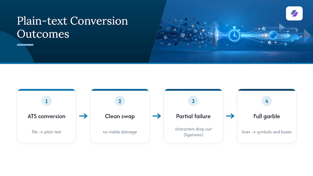
Ligatures are the quiet culprit most job seekers never think about. When a font merges letter pairs like “fi” or “fl” into a single glyph for visual polish, some parsers can’t split them back apart. The word “office” might parse as “o ce.” Smart quotes and special dashes cause similar glitches. According to a technical breakdown of how ATS handles fonts, these encoding mismatches are one of the most common reasons a technically strong resume gets flagged as incomplete.
Independent testing backs up the system-font recommendation with real numbers. ATS Verification’s testing across multiple parsers found that Calibri, Arial, Helvetica, Times New Roman, Garamond, Cambria, and Verdana all parsed cleanly, while several popular design fonts did not. That’s not a coincidence. Those seven fonts have been sitting on operating systems for so long that every parser has been built to expect them.
What Font Size and Spacing Should You Use?
Body text should sit between 10 and 12 points, with 11 points often considered a good balance for readability and space. Indeed’s guidance on resume fonts treats 11 to 12 point body copy as the standard for both readability and clean parsing. Your name can be set larger, around mid-teens in point size, and section headers can be slightly larger than body text to create visual hierarchy.
Pro Tip: If your resume is spilling onto a second page by a few lines, resist the urge to shrink the font below 10 points. Trim a bullet or tighten your margins instead. A cramped, tiny font hurts both the human reader and, at extreme sizes, the parser’s confidence in reading it accurately.
For spacing and margins:
- Line spacing between 1.0 and 1.15 keeps the page dense but not cluttered.
- Margins of 0.5 to 1 inch on all sides give the parser clean whitespace to work with.
- Avoid condensed or narrow font variants entirely. They save space but distort letter shapes in ways parsers sometimes misread.
Ten point text is the accepted floor. Anything smaller starts working against you on both ends: human recruiters squint, and parsers occasionally mishandle unusually tight kerning.
Should You Save Your Resume as a .docx or PDF?
.docx is the safer default for nearly every ATS you’ll encounter, according to guidance from MIT’s career office. PDF files can work too, but only under specific conditions, and this is where a lot of job seekers get tripped up.
- Confirm your PDF is text-based, not an image. A PDF built from a scanned document or exported as a flattened image looks fine to your eyes but reads as nothing to a parser.
- Check that fonts are embedded, not just referenced. An embedded font travels with the file, so it displays correctly on any machine. A referenced font relies on the receiving computer having that same font installed, and if it doesn’t, the system substitutes something else, sometimes badly.
- Test by highlighting text in the PDF. If you can select and copy the words, it’s text based. If clicking just selects the whole page like a photo, it’s an image, and you need to re-export it.
If you’re building your resume through a web-based resume tool, download the file and reopen it before you trust it. Fonts occasionally get lost in that export step, which is worth checking every single time.
Which Fonts Should You Avoid on Your Resume?
Script fonts, handwriting styles, and decorative fonts are the obvious offenders. Comic Sans, Papyrus, and Brush Script have no place on a resume, for ATS reasons and for the simple fact that recruiters associate them with unseriousness.
The less obvious trap is designer sans-serif fonts that look sleek on a portfolio site but were never built with ATS servers in mind. ATS Verification’s testing found that Avenir, Proxima Nova, Montserrat, and Poppins caused partial or full parsing failures in several systems. They’re popular in branding and design work, which is exactly why so many creative professionals accidentally use them where it counts against them.
A few more things to skip:
- Decorative bullet icons or symbol fonts used for visual flair
- Excessive bold, italic, and underline stacked on the same line
- Any font advertised as “web font” or “Google Font” unless you’ve confirmed it renders reliably in system-to-system tests
How Do You Test If Your Resume Will Pass ATS?
Testing takes five minutes and it’s the step most job seekers skip entirely.
- Copy and paste your resume text into Notepad or a similar plain text editor. This strips all formatting and shows you exactly what a basic parser would extract. Look for garbled characters, missing spaces, or broken words where ligatures might have merged letters incorrectly.
- Open the saved file on a different computer or operating system. Font substitution often only shows up when you leave your own machine, since your system already has every font installed that you used to build the file.
- Run the resume through a reputable ATS pre-check tool, or preview it through a resume builder that shows you the parsed output before you submit. JobAlign’s preview step, for example, lets you see how your resume will read after ATS extraction before you send it anywhere.
Pro Tip: Do the Notepad test on every version of your resume, not just your master copy. A single formatting tweak, like adding a fancy bullet style, can reintroduce a parsing problem you already fixed once.
Your 5-Minute ATS Font Checklist
Run through this before hitting submit on any application:
- Pick one safe font (Calibri, Arial, Times New Roman, Helvetica, Georgia, or Garamond) and use it throughout.
- Set body text within a readable range around 11 points, name larger to stand out, and headers slightly larger than body text.
- Save as .docx, or confirm your PDF is text-based with embedded fonts.
- Paste into Notepad and scan for garbled text or broken words.
- Open the saved file on a second device to catch silent font substitution.
| Check | Target |
|---|---|
| Font | Calibri, Arial, or another system font |
| Body size | 10–12 pt (11 pt preferred) |
| File type | .docx, or text-based PDF with embedded fonts |
| Plain-text test | No garbled characters or dropped letters |
Do Taleo and iCIMS Handle Fonts Differently?
Not every ATS platform parses text the same way, and that’s part of why sticking to universal system fonts matters so much. Older, enterprise-heavy systems like Taleo were built years ago on parsing engines that favor plain formatting and standard fonts, sometimes struggling more with tables, columns, and text boxes than with the font itself. Newer platforms like iCIMS tend to have more forgiving parsing engines, but “more forgiving” doesn’t mean immune. Both still rely on font recognition as the first step in extracting your text correctly.
The practical issue is that you rarely know which ATS a company uses. Job postings don’t list it, and even recruiters sometimes don’t know offhand which vendor powers their pipeline. That uncertainty is exactly why the safest approach is a lowest-common-denominator one: pick a font every major parser has been tested against for years, rather than betting on a specific platform’s tolerance.
Some ATS platforms also handle multi-column layouts, text boxes, and header/footer placement differently, which compounds font risk. A resume built with a designer font inside a text box, for instance, stacks two known risk factors on top of each other. If a platform mishandles one, the other makes the failure worse. Keeping your resume in a single column, with body text in the main content area rather than headers or footers, removes one variable so font compatibility isn’t fighting against layout problems at the same time.
Does Font Choice Affect How Recruiters Read Your Resume?
Passing the ATS gets your resume into human hands. What happens after that is a second test, and font choice still matters there, just for different reasons.
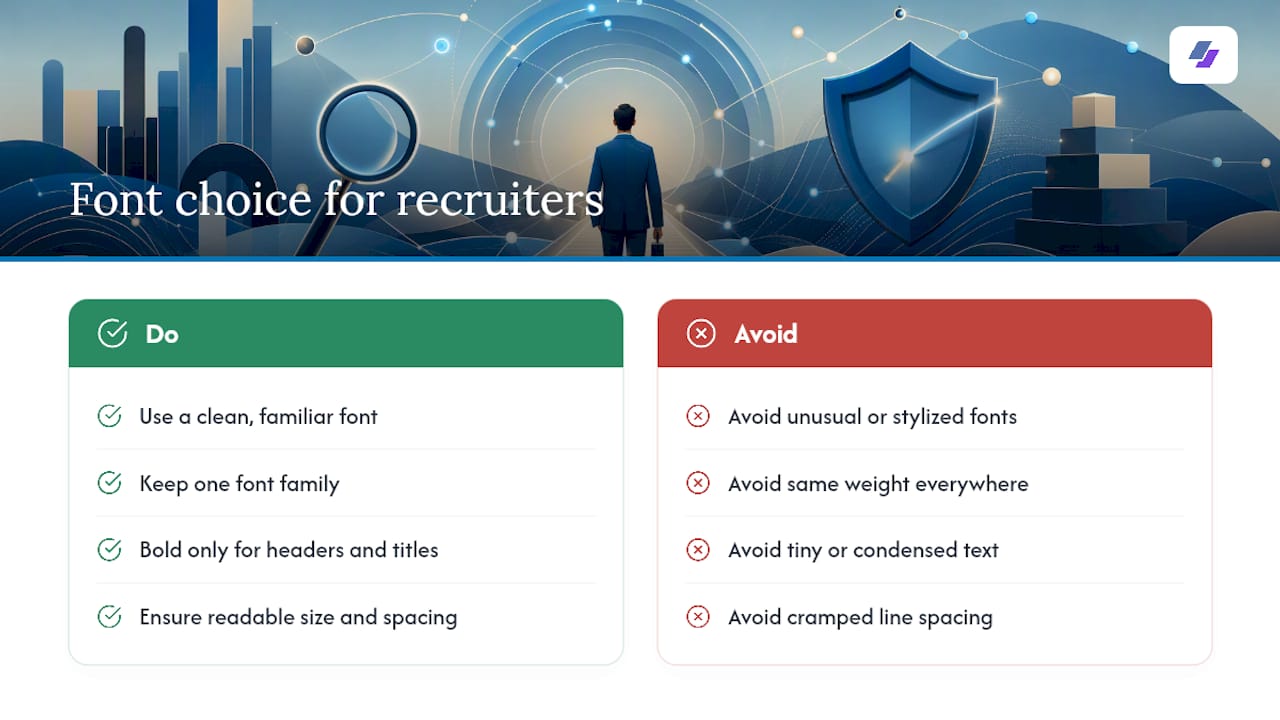
Recruiters scan resumes in seconds, not minutes. A clean, familiar font lets their eyes move down the page without friction. An unusual or overly stylized font, even one that technically parses fine, can slow that scan down or read as trying too hard. ATS Verification’s research notes that once a font parses cleanly, the difference between safe options comes down to personal readability preference, not ranking advantage. In other words, the ATS doesn’t care whether you chose Calibri over Georgia. The recruiter reading it afterward might have a mild preference, but neither will actively hurt you.
Where font choice really shows up for human readers is contrast and hierarchy. A resume that uses the same font weight for everything looks flat and forces the recruiter to hunt for your job titles and dates. One consistent font family, with bold used only for section headers and job titles, gives a recruiter’s eye a clear path through the page. That structure matters more to the human read than the specific font name ever will.
Fonts that are too small, too condensed, or set with cramped line spacing create a second kind of failure: a resume that’s technically ATS-safe but exhausting to skim. Recruiters spend an average of a few seconds per resume before deciding whether to keep reading, so anything that slows that first pass down works against you regardless of what the ATS thinks.
Do Acceptable Resume Fonts Vary by Country or Industry?
Font expectations shift more by industry and formality than by geography, but there are some regional patterns worth knowing. In the United States, sans-serif fonts like Calibri and Arial have become the default for most industries outside of law, academia, and traditional finance, where serif fonts like Times New Roman still signal seriousness.
European and UK employers, particularly in more traditional sectors, tend to lean slightly more toward serif fonts across the board, even in tech and marketing roles where American resumes have shifted sans-serif. This isn’t a hard rule, and it’s changing as global companies standardize hiring practices, but if you’re applying to a company headquartered outside the US, a slightly more conservative font choice, like Garamond or Cambria over Calibri, rarely hurts and can align better with local expectations.
Creative industries carry their own informal norms almost everywhere: a marketing or design role often tolerates a modern sans-serif font that would look out of place in a law firm application. But “tolerates” doesn’t mean the ATS treats it more gently. Regional and industry norms affect how a human reads your resume. They don’t change how a parser extracts it. The font list that passes ATS testing stays the same no matter which country’s job board you’re applying through, which is exactly why sticking to system fonts is the one piece of advice that travels well across borders.
Balancing ATS Safety With Personal Branding
Here’s where I push back a little on the all-or-nothing framing you see in a lot of resume advice: you don’t have to choose between passing the ATS and having a resume that reflects you.
If you’re in a creative field, portfolio, design, or a role where visual presentation genuinely matters, submit an ATS-safe version built with one of the system fonts covered here, and link to a design-forward portfolio or personal site in your header. That gives the algorithm what it needs and gives a human reviewer the fuller picture once they’re past the first filter.
For every other role, the calculation is simpler. There’s no upside to a stylized font on a resume for an accounting job or a project management role. Prioritize the safe font and the safe file type every time. If you want a fast way to generate a resume that’s already built around these rules, JobAlign’s ATS-optimized templates handle the font and format decisions for you, so you’re not second-guessing every export.
— Johan
Skip the Guesswork With JobAlign’s ATS-Safe Templates
Every font, spacing, and file-format rule covered in this guide gets applied automatically when you build a resume with Jobalign. Instead of manually checking whether your PDF has embedded fonts or your Calibri body text is set to 11 points, Jobalign syncs directly with your LinkedIn profile, pulls your experience and skills, and drops them into templates already built around ATS-safe fonts and clean formatting. You get a tailored, keyword-optimized resume for each job application without opening a font menu once.
Start with a free LinkedIn resume to see the process in action, no setup required. If you’re applying to multiple roles and want unlimited tailored versions, plans start with the Solo package at €4.80 one-time, scaling up to Ultimate for job seekers running a high-volume search. Sync your profile now and see your first ATS-ready resume in minutes.
Sources
This guide draws on MIT’s Career Advising and Professional Development office for institutional formatting standards, Microsoft’s typography documentation for font availability data, ATS Verification’s parser testing for empirical pass/fail results, and Indeed’s career advice guidance on sizing standards.
- Make your resume* ATS-friendly – Career Advising & Professional Development | MIT
- Cambria - Microsoft typography
- Best Fonts for ATS Resumes (2026), Tested | ATS Verification
- Best font for a resume: How to choose type and size | Indeed
FAQ
What Is the Best Font for a Resume?
Calibri and Arial are the most commonly recommended choices because they’re preinstalled on virtually every system and have tested cleanly across ATS parsers, though Times New Roman, Helvetica, Georgia, and Garamond are equally safe options.
Which Fonts Are Not Recommended for a Resume?
Avoid script and decorative fonts like Comic Sans, Papyrus, and Brush Script, along with popular design fonts such as Avenir, Proxima Nova, Montserrat, and Poppins, which have shown partial or full parsing failures in ATS testing.
Is Calibri or Arial Better for a Resume?
Both parse reliably across tested ATS platforms, so the choice comes down to personal preference. Calibri reads slightly softer and more modern, while Arial feels a touch more neutral and traditional.
Should a Resume Use 11 or 12 Point Font?
Either works, but 11 point is the more common choice since it balances readability with fitting more content on the page without feeling cramped.
Does JobAlign Automatically Use ATS-Safe Fonts?
Yes. Jobalign’s templates are built around tested system fonts and clean formatting, so every resume generated through its LinkedIn sync stays within the font and spacing ranges covered in this guide.